Overview
Lawpay is payment processing tool for lawyers. In short, it routes credit card transactions to their appropriate accounts so lawyers don't have to worry about the co-mingling of fees. While the tool itself is useful, its website wasn't and as a UX Intern at Springbox, it was my job to revamp the site architecture and content. After reviewing data from google analytics, usability tests and the stakeholders, several key problems with the site stood out.
Problems to Fix
Problems with the existing site architecture included:
- Lots of redundant content
- Unclear calls to action and poor product explanation
- Vague navigational structure and unclear user paths
- No feedback (i.e. active states) for the user to see where he/she is
- Inconsistent terminology
- News and events buried within the site
Some Solutions
LawPay HomePage
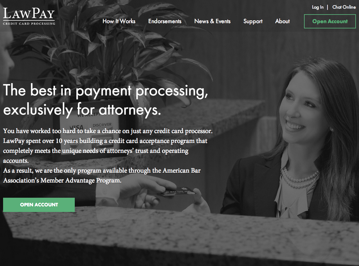
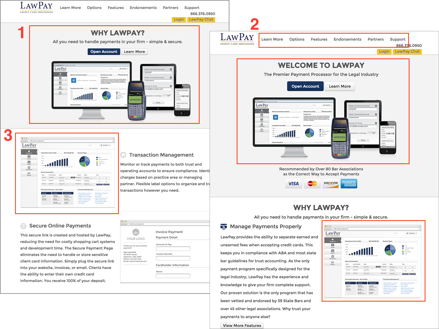
I've picked out a few pages Below we have a side by side comparison of the home page and feature page demonstrating some of the issues mentioned above. The image on the left is the homepage while the image on the right is the features landing page. The goal of Lawpay's homepage is to concisely inform lawyers what Lawpay is and how it could improve their payment processing while also establishing a sense of legitimacy and trust. The page also needed to provide a clear call to action for potential customers and highlight support information for existing customers. The old homepage failed to do either of these effectively.
If you look at the global navigation, you'll notice its appearance never changes, making it difficult to know which page you're on. The content categories are also vague; should a user wishing to know more about the product click on Options, Learn More or Features? (2)
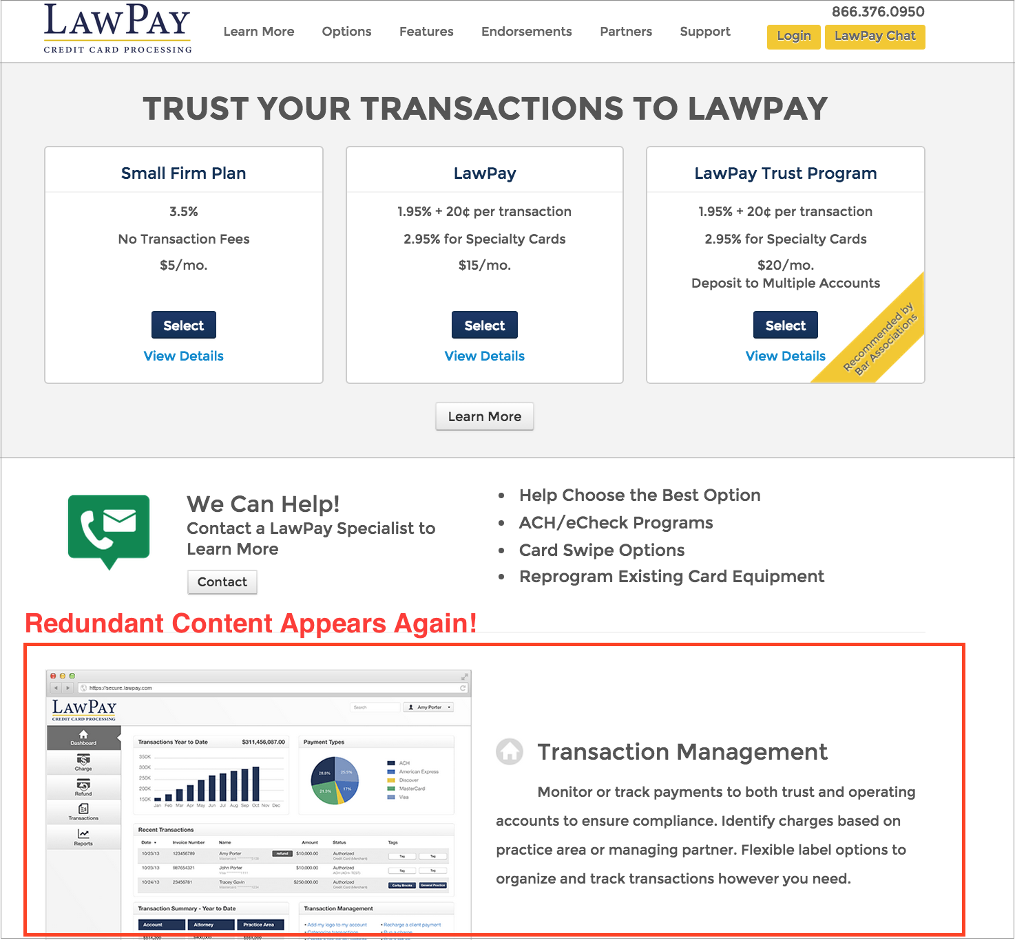
Further compounding this confusion is the repetitive content: the hero image from the homepage is repeated on the content page and images such as the generic graph screenshot are used repeatedly across site sections and content blocks, creating the sensation that each page contains not unique content, but just a reiteration of what came before. (1 & 3).
Options Page - Which is best for you?
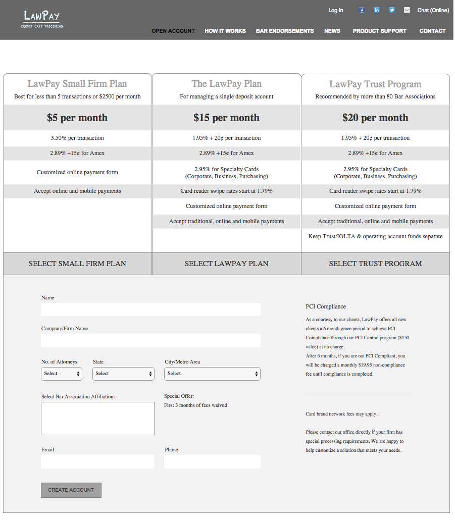
The primary goal of the Lawpay site is to explain the product subscriptions and get users signed up; however, the unclear user paths and repeated content distracted from this main call to action. The information provided for each subscription tier failed to accurately describe the differences between each plan and in no way helped the user to decide which option best suited their needs. The existing site also gave no indication of how involved the signup process was--sprinkled along the site were mysterious and out of context "Open Account" buttons.
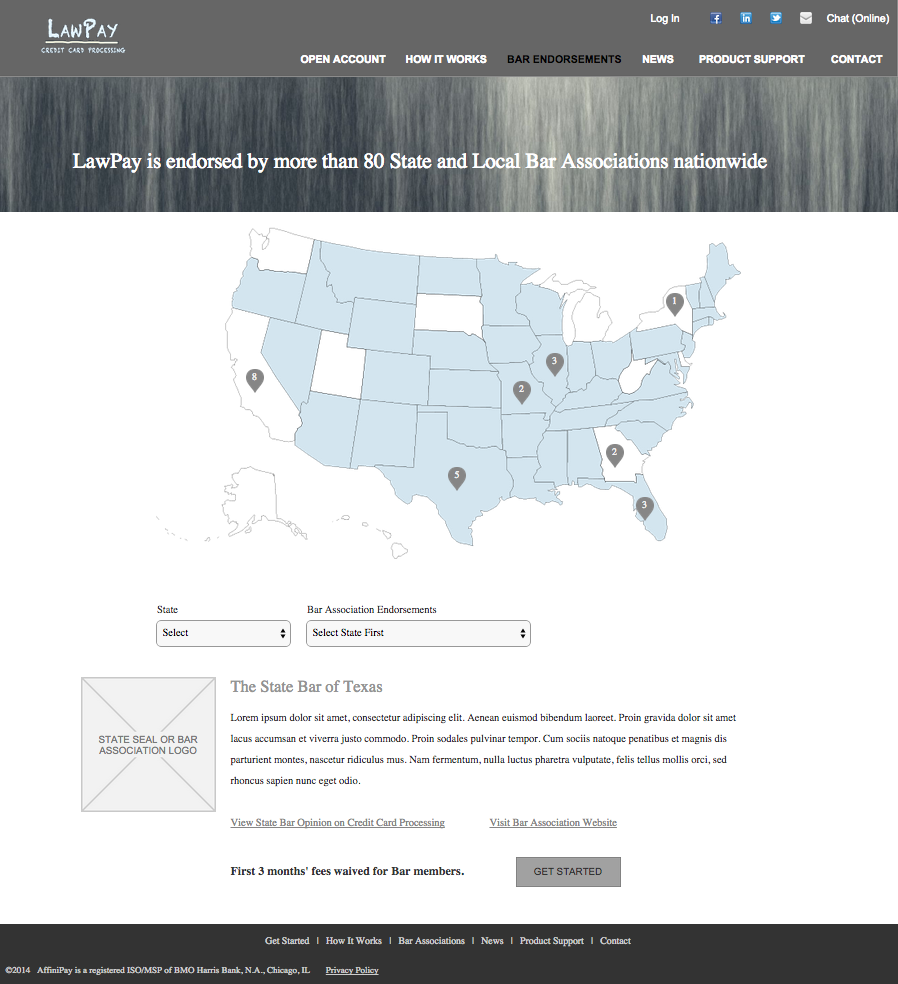
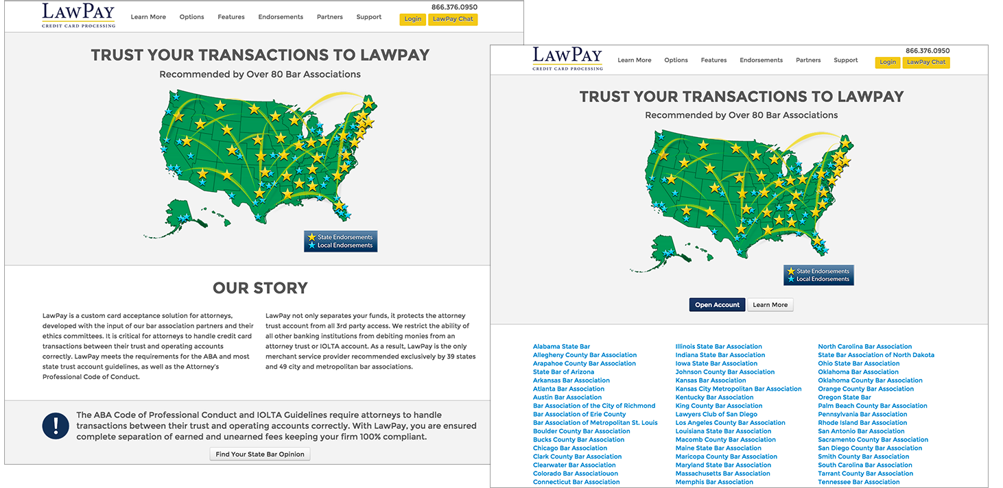
Over 80 bar associations across the United States endorse the Lawpay product, which is a big deal and helps boosts the product's credibility, but the old design failed to convey this. Endorsement information was located on a page with a static map (also reused in multiple places across the site) perched over columns of links to state bar pages.
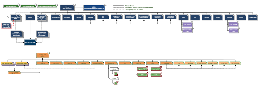
A look at the site map below further illustrates the issue. The site suffered from a shallow but wide structure meaning that many pages were only reachable through one path or existed as dead ends. Additionally, many pages included slightly similar content with slightly different wording descriptions which added even more confusion. Had I just looked at this page? Is this page describing the same thing or another product?